Friday, October 29, 2010

Airports


Potential
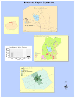
     I found ArcGIS to have a lot of applicability in the expanding global, and ever-changing world.  Its most useful feature has to be its ability to both analyze and combine data as well as visualize that data.  In the past doing the two of those would have taken considerable time, yet with this program it takes only minutes to enter the data and turn it into a map.  in an age when everything is connected and affecting many other facets of people's lives on both a local and global scale it is important for information to be transmitted as quickly and efficiently as possible.  This also means that is would be useful for any number of fields as well, branching out of simply governmental functions but into the private sphere as well, allowing anyone with the time to learn how to use the program to be able to analyze any number of different processes.
     The program does have a steep learning curve, and would be difficult outside of a setting such as this to learn, however, that just makes it more interactive and adds depth that other programs may not have.  it can do any number of things, each as in depth as you want to go.  It is not confined to any one thing.  The broad range of applications available mean that it is not necessarily useful for only large projects or calculations, but can be used for as trivial of a task as one would desire.  It is also very interactive, allowing one to manipulate the data, graphs, and maps to fit the need.  I enjoyed being able to add a road to a map rather easily, giving me both a sense of control but also the manipulative abilities of the entire program. 
Pitfalls
    That being said, the learning curve for the program is rather steep.  Even after having done the tutorial multiple times I would still by no means say that I understood all the ins and outs of the program.  On top of that, I feel that the tutorial only really scratches the surface and allows you to only do rather simple projections compared to the potential of the entire thing.  It will still take some time to feel even proficient in using the program on my own.  This means that for this program to have much applicability to to the general public it would have to become more simplistic, as I do not see this being a wide spread tool as is outside a setting such as this.  A course is really necessary to ever be able to effectively use this software.
     That means that this program will really be relegated to government agencies and rather large corporations who have a need for this information.  It is a desirable function, but as is I feel those without the money or training to run this program will choose to instead use other neogeography applications such as Google Maps which are free and more user friendly.  This will be especially true as they become more available and even easier to use, as well as having more and more functions.


Tuesday, October 12, 2010

My Hellish Drive to UCLA


View My Hellish Drive to UCLA in a larger map


Every time I have visited UCLA, or moved in our out from school i have had to drive over 400 miles from Sacramento to Los Angeles. Total i have had to make the 6 or 7 hour drive about 7 times now, and it only gets worse every time. I absolutely hate this drive, so I have decided to make a map depicting the many points of interest along the way, of which there are very few.  Because of this fact I have had to supplement my map with locations of interest that are only of interest to my own personal experiences.
My parents drive, and they are incredibly slow.  This makes this journey even more excruciating.  There is no scenery along the I-5, there are no cities, and there is no civilization.  My map at times is rather sarcastic at times when dealing with the many "sites" we come across.  Humor is all that keeps me going on these trips, as I can almost never fall asleep in the car, and I get carsick rather easily.  This leaves me almost nothing to do for the entire trip, making it one of my least favorite things in the world to do, up there with going to the dentist.  I hope you enjoy my map, as it was meant to entertain, while giving you just a little insight into something I must endure far too often.

Tuesday, October 5, 2010

Reading Topograpihc Maps

1. The name of the quadrangle is the "Beverly Hills Quadrangle."

2. There are eight adjacent quadrangles.  1) Canoga Park  2) Van Nuys  3) Burbank  4) Topanga  5)    Hollywood  6) N/A  7) Venice  8) Inglewood 

3. The quadrangle was created in 1995.

4. There are two datums for horizontal, and one for vertical.  The two for horizontal are The North American Datum of 1927 as well as the North American Datum of 1983.  The datum for the vertical is The National Geodetic Vertical Datum of 1929.

5. The scale is 1:24,000.

6. a) 5 centimeters is equivalent to 1,200 meters because 5x24,000= 120,000 cms which converts to 1,200m
    b) 5 inches is equivalent to 1.89 miles because 5x24,000= 120,000in which converts to 10,000ft. 1mi=5280ft so 10,000/5280=1.89 thus 5in equals 1.89 miles.
    c) 1 mile equals 2.64 inches on the map because 1mi=5280ft x 12in=63360in, thus 63360in/24000scale= 2.64 in
    d) 3 kilometers equals 12.5 cms on the map. 3km= 3000m. 3000/24000= .125m= 12.5cm

7. The contour interval on the map is 20 feet.

8. a) Latitude is Y x7.5'. Y= 3.50mi/8.60mi = .407. Thus .407x7.5'= 3.0525'. Thus the latitude is 34 07' 30" - 3' 3"= 34 04' 27" or 34.074.  For Longitude, Y= 3.7mi/7.2mi= .514. Thus .514x7.5'= 3.855'.  Thus the longitude is 118 22' 30"+ 3' 51"= 118 26' 21" or 118.4391.
34.074N, -118.4391W or 34 04' 27"N, -118 26' 21"W

    b) Y=8.1/8.6= .942.  .942x7.5' = 7.064'.  34 07' 30"- 7'4"= 34 0' 26" or 34.0072
        Y= 7.18/7.2= .9976.  .9976x7.5'= 7.482.  118 22' 30" + 7' 29" = 118 29' 59" or 118.49972
34.0072N, -118.49972W or 34 0' 26"N, 118 29' 59"W      

    c) Y=.34/8.6= .040.  .04x7.5'= .3'.  34 07' 30" - 20" = 34 07' 10" or 34.1194
        Y= 2.0/7.2= .2778.  .2778x7.5' = 2.0835'.  118 22' 30" + 2' 05" = 118 24' 35" or 118.4097
34.1194N, -118.4097W or 34 07' 10"N, -118 24' 35"W

9. a) 560'
    b) 140'
    c) 620'

10. This map uses UTM zone 11

11. (3)61.5 Easting and (37)63 Northing

12.  1000m x 1000m= 1,000,000 m^2

13.

14. The magnetic declination of the map is 14 degrees east.

15. The water is flowing south.

16.

Friday, October 1, 2010

Maps Are Political


Maps can be used for a variety of ways, and are often subjective.  Many have political undertones, or even  have a blatant message.  Maps can often be used as propaganda, or as a way to better prove a point.  This can be seen in the way that a simple world map is represented.  It does not properly display the scale of continents and countries, causing areas to appear larger the farther away they get from the equator.  This is a simple misrepresentation, as it is one of the few ways to accurately display the entire planet on one contiguous map. 

 Free Vector World Maps Collection at http://www.webresourcesdepot.com/free-vector-world-maps-collection/.  http://www.webresourcesdepot.com/free-vector-world-maps-collection/.  October 1, 2010 11:30am


This however is not a perfect representation of size, showing common, innate perceptions of our world as a whole.  A more accurate map, at least of scale is the Peter's Projection Map.


Peter's Projection World Maps at http://www.odtmaps.org/link.htm.  http://www.odtmaps.org/images/1_peters_new.jpg October 1, 2010 at 11:30am


Our perception of the world is often very skewed by maps for the simple fact that it is a projection of a three dimensional object into only two dimensions.  When viewing the world this can have political consequences in the sense that importance or status is often represented by size and prominence.  However, this is warped by the creation of maps that do not properly represent this, making this particular map a more efficient projection of our world. The first map skews areas that are often considered to be more influential, especially the Northern Hemisphere, with both Africa and South America appearing to be far smaller than they actually are.  This can be dated back to the late 19th century and geographers such as Mackinder.  It causes Europe and especially Russia to seem far larger than they actually are, showing their prominence and even the threat they pose to the entire world.

Other maps much more directly show differences between countries.  This map alters its display of the world to show an equally as important aspect of states: their population.  


Another World Population at http://rs.resalliance.org/2006/02/16/another-world-population-map/.  http://rs.resalliance.org/2006/02/16/another-world-population-map/ October 1, 2010 at 11:30am


We can now clearly see what parts of the world havethe largest populations, which can give insight into certain aspects of these areas.  Despite prominence and power on the world stage, many European countries, including Russia, actually constitute only a small portion of the world's population, showing the disproportionate distribution of power and wealth throughout the globe.  It also shows large areas of overpopulation and parts of the globe that may be threatened by a lack of resources.  

Population is only one indicator of nations place in this world, and often can be contributed to a lower GDP as the more educated tend to have less children, just as more children can often equate to a need for more manual labor, and thus a lower income nation as a whole.  Other factors are needed to show a nations wealth, and even how they choose to use that wealth, either wastefully or efficiently.


Worldmapper Cartograms Revisualuize the World at http://www.inhabitat.com/2008/09/01/worldmapper-cartogramps-revisualize-the-world/.  http://www.inhabitat.com/wp-content/uploads/c02levels1.jpg October 1, 2010 11:30am


This map shows the distribution of the world's CO2 levels as represented by size.  Similar to the population map it warps certain areas to show the disparity between many of the nations, and the wastefulness of some countries.  When compared with the previous map it shows the disproportionate use of resources, especially oil by the United States and Europe.  It also shows the while China use a large amount of the world's oil, as it also has a large amount of the world's population, possibly justifying the amount that they use.  

In general, it is almost impossible to create a purely objective map.  A simple projection causes certain areas to become more prominent.  However, even by creating a map to scale based purely on size,. such as the Peter's Projection is also sending a message about the way we view our world, and it too is not without its own implications.  Other maps are even less subtle about what they are attempting to portray, and are even more political in their usage.  Overall, maps can be used for any number of uses, and often can have multiple meanings and purposes outside of the most obvious ones.