Maps can be used for a variety of ways, and are often subjective. Many have political undertones, or even have a blatant message. Maps can often be used as propaganda, or as a way to better prove a point. This can be seen in the way that a simple world map is represented. It does not properly display the scale of continents and countries, causing areas to appear larger the farther away they get from the equator. This is a simple misrepresentation, as it is one of the few ways to accurately display the entire planet on one contiguous map.

Free Vector World Maps Collection at http://www.webresourcesdepot.com/free-vector-world-maps-collection/. http://www.webresourcesdepot.com/free-vector-world-maps-collection/. October 1, 2010 11:30am
This however is not a perfect representation of size, showing common, innate perceptions of our world as a whole. A more accurate map, at least of scale is the Peter's Projection Map.

Peter's Projection World Maps at http://www.odtmaps.org/link.htm. http://www.odtmaps.org/images/1_peters_new.jpg October 1, 2010 at 11:30am
Our perception of the world is often very skewed by maps for the simple fact that it is a projection of a three dimensional object into only two dimensions. When viewing the world this can have political consequences in the sense that importance or status is often represented by size and prominence. However, this is warped by the creation of maps that do not properly represent this, making this particular map a more efficient projection of our world. The first map skews areas that are often considered to be more influential, especially the Northern Hemisphere, with both Africa and South America appearing to be far smaller than they actually are. This can be dated back to the late 19th century and geographers such as Mackinder. It causes Europe and especially Russia to seem far larger than they actually are, showing their prominence and even the threat they pose to the entire world.
Other maps much more directly show differences between countries. This map alters its display of the world to show an equally as important aspect of states: their population.
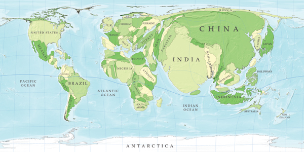
Another World Population at http://rs.resalliance.org/2006/02/16/another-world-population-map/. http://rs.resalliance.org/2006/02/16/another-world-population-map/ October 1, 2010 at 11:30am
We can now clearly see what parts of the world havethe largest populations, which can give insight into certain aspects of these areas. Despite prominence and power on the world stage, many European countries, including Russia, actually constitute only a small portion of the world's population, showing the disproportionate distribution of power and wealth throughout the globe. It also shows large areas of overpopulation and parts of the globe that may be threatened by a lack of resources.
Population is only one indicator of nations place in this world, and often can be contributed to a lower GDP as the more educated tend to have less children, just as more children can often equate to a need for more manual labor, and thus a lower income nation as a whole. Other factors are needed to show a nations wealth, and even how they choose to use that wealth, either wastefully or efficiently.

Worldmapper Cartograms Revisualuize the World at http://www.inhabitat.com/2008/09/01/worldmapper-cartogramps-revisualize-the-world/. http://www.inhabitat.com/wp-content/uploads/c02levels1.jpg October 1, 2010 11:30am
This map shows the distribution of the world's CO2 levels as represented by size. Similar to the population map it warps certain areas to show the disparity between many of the nations, and the wastefulness of some countries. When compared with the previous map it shows the disproportionate use of resources, especially oil by the United States and Europe. It also shows the while China use a large amount of the world's oil, as it also has a large amount of the world's population, possibly justifying the amount that they use.
In general, it is almost impossible to create a purely objective map. A simple projection causes certain areas to become more prominent. However, even by creating a map to scale based purely on size,. such as the Peter's Projection is also sending a message about the way we view our world, and it too is not without its own implications. Other maps are even less subtle about what they are attempting to portray, and are even more political in their usage. Overall, maps can be used for any number of uses, and often can have multiple meanings and purposes outside of the most obvious ones.
No comments:
Post a Comment