Monday, December 6, 2010

2000 Census Maps

     All three of these maps are very interesting in showing the dynamic between races throughout our country. This clearly shows the multiculturalism of our country, and that we may in fact not be a true melting pot.  There are many pockets throughout the country that are predominantly one or two races and nothing more.  This often has historical ties, for example in the south with African Americans and in California with Asians and Hispanics.  Another interesting that these maps display is the lack of minorities that reside in the Midwest and the North.  This too has historical ties, but also shows the lack of movement of migrants, who seem to stay almost solely along the coasts, or at least very close to where they entered this country.
     What is equally as interesting for me at least is the lengths to which I had to go to make certain maps look like there was any variety, as many counties falls within about five percent of each other.  This shows two major aspects for me.  First, the lack of dispersal of minorities in our country, as they seem to stay in their destination of origin, creating their own niches and cultural havens.  The second aspect, which has much more bearing on GIS, is how malleable these maps are.  I was able to change them at the drop of a hat to project the figures how i saw fit.  This has political capabilities as we have seen in more professional maps, but the fact that it was my own creation is what really nailed this point home.  I chose to try and make maps as aesthetically pleasing as possible, with a wide range of colors and distributions, but that does not mean i could not have adapted them in any number of other ways.
Black
     This map speaks volumes about the history of country.  Even after the Civil War, Jim Crow laws, and the Civil Rights movement, we still see African Americans residing almost predominantly in the south.  I think this goes to show what many of these maps do, which is that people really do not move around as much as we might expect.  They find their home, and even if there may be someplace better or more suited to them out there they do not necessarily move.  This is what i really got out of creating these maps.

Asian
     The same seems to be true for the Asian population and where they choose to reside.  There are large clumps in California, especially in the the Bay area and in New York.  These are major harbor towns, so this seems where immigrants come in, and then simply stay.  Enclaves are created, and the culture permeates into the city, creating a setting similar to what they may be used to.  This is why there is so little dispersal across the nation, as once again people become ingrained in their own cultural comfort zone and stay there their entire lives.

Hispanics
     This map is not too surprising, showing a large distribution in the south and west.  What is interesting is that Hispanics are now the most numerous minority, and this is very evident from this map.  They are also much more spread out than the other two races.  This has to do with the fact that they are so lumped together as a catch-all term, when in fact there are a number of different cultural traditions and places of origin that fall under the term Hispanic.

Tuesday, November 16, 2010

Station Fire


     The Los Angeles station fire started on august 26, 2009 and raged on for about 2 months before finally being able to be put out.  Once the fire was contained it had burned such a large amount of acreage that it was determined to be the tenth largest fire in California history  It was so named for the fact it burned very closely to Mount Wilson, on top of which were approximately 20 radio station towers.  Unlike most fires that occur that simply burn brush and grassland fuel, this turned into a true crown fire, burning fully grown trees, an occurrence that is rather rare for the amount of heat and power of a fire that is needed to do so is tremendous.  This is because trees are far wetter than the simple dry brush that most fires consist of.
      The reason this was such a disastrous fire was because it was a crown fire and not simply a brush fire.  This comes about from simply misunderstanding and misinforming people about fire ecology.  From a young age we are taught that all forest fires are bad fires, being brought up on the teaching of Smokey the Bear.  We have to do whatever we can to avoid starting forest fires, and while this may be true on a certain level, it is incorrect on another more important level.  By attempting to stop all forest fires, dry brush and fuel accumulate, meaning that should a fire ever start, there is much more fuel and it is much more likely to start a true crown fire.  This method of prevention would only ever be possible if we were able to completely stop all fires from ever happening, which would be impossible, as natural not just man-made fires do exist.  In this sense then, a reeducation process is needed to inform people of how fire ecology truly works in hopes that we can stop future large scale fires.  
     The first map shows simply the extent of the fire during the first four days of the fire.  It shows just how quickly it spread in just four days, covering over 200 square miles by September 3.  This shows just how powerful of a fire this was, and how much damage it could have caused.
     The second thematic map shows a number of different pieces of infrastructure that could have been affected by the fire.  Fortunately, the fire seems to have been rather contained to the forest, not spreading too much into the more populated areas.  That being said, by August 31 10,000 homes were evacuated.  By September 3, 64 residences had been destroyed, along with 7 other commercial or other buildings.  This is an incredible amount of destruction, but it could have been much worse.  As detailed by the thematic map, the fire affected very few institutions, hospitals, and airports, but came very close to spreading into areas that contained a number of these.
     The main problem that was faced in fighting this fire was the lack of access that firefighters had to the area.  I included the highways in the area in the second map as well, showing that there are very few roads that access the area.  This lack of accessibility caused serious problems in fighting this fire and is why it took almost two months to put the fire out.  At one point two firefighters died from driving off of a 700 foot cliff because of the poor visibility, but more because the road systems were so difficulty to navigate. 


http://gis.ats.ucla.edu//Mapshare/Default.cfm
http://seamless.usgs.gov/website/seamless/viewer.htm
http://gis.lacounty.gov/eGIS/
http://www.lasdblog.org/Pressrelease/PR_Folder/SFUpdateTH-00.pdf
http://www.cnn.com/2009/US/08/31/california.wildfires/index.html
http://www.smokeybear.com/

Tuesday, November 9, 2010

DEMs

DEM of South Lake Tahoe

     I chose to do the southern most point of Lake Tahoe.  I chose this because it is a diverse landscape allowing for a good display of elevation.  It is also interesting to see that the lake actually is not the lowest point on the map, rather a valley to the east.  The main reason i chose this specific landscape however is because this is Tahoe is one of my favorite places in the world.  I was raised as a skier, and my father was actually in the Sierra ski patrol.  He passed on his love for skiing to my brother and me, so it is really interesting to see a map of a place i have been going to my entire life that I actually created.  The latitudes and longitudes of this map are 39.043⁰N at top,  38.761⁰ N at bottom, -120.394⁰ W at left, -119.815.  The geographic coordinate system used is WGS 1984 (World Geodetic System 1984). This is a geocentric ellipsoid.


Tuesday, November 2, 2010

Map Projections

     Map projections are a way of viewing our three-dimensional world in a more simplistic two dimensions.  This allows us to view them in a way that allows us to analyze them in the way that we often think of the world.  In doing so however, it can often lead to the warping of many aspects of the world, making two maps of the same image or projection drastically different, causing serious problems, especially in navigation.  This is made very evident in the differences in miles of the six map projections I have placed below.  The fact that these maps are even remotely close in the distance to Washington D.C and Kabul, Afghanistan is rather surprising.  Map projections come in three different types: conformal, equidistant, and equal area projections. All three are represented below, each have different purposes, but also different pitfalls.
     Conformal maps preserve angular relationships, and in the case of distance make them rather accurate, and thus better for navigation.  They allow for distance to be preserved between areas, but in doing so can drastically distort the area of places.  This is not a horrible thing, but can cause problems when we consider the fact that these are often the most common form of map projection because they are the easiest to understand without a background in GIS, and are also the simplest to understand spatially.  When it comes to politics however, the distortion of area means that certain area or countries are perceived to be more powerful, or taking up more space than others, leading to misunderstandings on a public but also a governmental level.  This is especially evident in the two conformal maps I have represented below, specifically the Mercator projection, which displays countries such as Russia to be far larger than they actually are.
     Equidistant maps preserve distance from a specific point of origin.  In this case I have two maps which preserve both latitudinal and longitudinal distance.  The conic is useful in preserving distance longitudinally, but only in the northern hemisphere, which in this case is not helpful, but still coincidentally gives us a fairly accurate estimated distance.  The cylindrical one would be more useful for measuring the distance between our two points because they are about the same latitude, but this would not be a good map when wanting to measure distance from north to south.  These maps are only useful across clear lines of latitude and longitude, and are not good for diagonal measurements or in maintaining the true shape and area of the world.
     The final set of maps deals with maintaining equal area, but not necessarily distance.  The Bonne projection even is only useful in maintaining the area of a few places on the map, such as Africa, while the North pole Equal area map is really only useful for the northern hemisphere, and even then is really only accurate close to the north pole.  These maps give us a better sense of the way that the world truely is on a more three dimensional platform, but really only in certain areas, and does not deal with distance between places.


Conformal
 Mercator Projection: 7,000 miles


 Gall Projection: 7,000 miles

Equal Area
Bonne Projection: 6,600 miles

North Pole Equal Area: 6,850 miles

Equidistant
 World Equidistant Conic: 6,800 miles

World Equidistant Cylinder: 5,800 miles


Friday, October 29, 2010

Airports


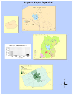
Potential
     I found ArcGIS to have a lot of applicability in the expanding global, and ever-changing world.  Its most useful feature has to be its ability to both analyze and combine data as well as visualize that data.  In the past doing the two of those would have taken considerable time, yet with this program it takes only minutes to enter the data and turn it into a map.  in an age when everything is connected and affecting many other facets of people's lives on both a local and global scale it is important for information to be transmitted as quickly and efficiently as possible.  This also means that is would be useful for any number of fields as well, branching out of simply governmental functions but into the private sphere as well, allowing anyone with the time to learn how to use the program to be able to analyze any number of different processes.
     The program does have a steep learning curve, and would be difficult outside of a setting such as this to learn, however, that just makes it more interactive and adds depth that other programs may not have.  it can do any number of things, each as in depth as you want to go.  It is not confined to any one thing.  The broad range of applications available mean that it is not necessarily useful for only large projects or calculations, but can be used for as trivial of a task as one would desire.  It is also very interactive, allowing one to manipulate the data, graphs, and maps to fit the need.  I enjoyed being able to add a road to a map rather easily, giving me both a sense of control but also the manipulative abilities of the entire program. 
Pitfalls
    That being said, the learning curve for the program is rather steep.  Even after having done the tutorial multiple times I would still by no means say that I understood all the ins and outs of the program.  On top of that, I feel that the tutorial only really scratches the surface and allows you to only do rather simple projections compared to the potential of the entire thing.  It will still take some time to feel even proficient in using the program on my own.  This means that for this program to have much applicability to to the general public it would have to become more simplistic, as I do not see this being a wide spread tool as is outside a setting such as this.  A course is really necessary to ever be able to effectively use this software.
     That means that this program will really be relegated to government agencies and rather large corporations who have a need for this information.  It is a desirable function, but as is I feel those without the money or training to run this program will choose to instead use other neogeography applications such as Google Maps which are free and more user friendly.  This will be especially true as they become more available and even easier to use, as well as having more and more functions.


Tuesday, October 12, 2010

My Hellish Drive to UCLA


View My Hellish Drive to UCLA in a larger map


Every time I have visited UCLA, or moved in our out from school i have had to drive over 400 miles from Sacramento to Los Angeles. Total i have had to make the 6 or 7 hour drive about 7 times now, and it only gets worse every time. I absolutely hate this drive, so I have decided to make a map depicting the many points of interest along the way, of which there are very few.  Because of this fact I have had to supplement my map with locations of interest that are only of interest to my own personal experiences.
My parents drive, and they are incredibly slow.  This makes this journey even more excruciating.  There is no scenery along the I-5, there are no cities, and there is no civilization.  My map at times is rather sarcastic at times when dealing with the many "sites" we come across.  Humor is all that keeps me going on these trips, as I can almost never fall asleep in the car, and I get carsick rather easily.  This leaves me almost nothing to do for the entire trip, making it one of my least favorite things in the world to do, up there with going to the dentist.  I hope you enjoy my map, as it was meant to entertain, while giving you just a little insight into something I must endure far too often.

Tuesday, October 5, 2010

Reading Topograpihc Maps

1. The name of the quadrangle is the "Beverly Hills Quadrangle."

2. There are eight adjacent quadrangles.  1) Canoga Park  2) Van Nuys  3) Burbank  4) Topanga  5)    Hollywood  6) N/A  7) Venice  8) Inglewood 

3. The quadrangle was created in 1995.

4. There are two datums for horizontal, and one for vertical.  The two for horizontal are The North American Datum of 1927 as well as the North American Datum of 1983.  The datum for the vertical is The National Geodetic Vertical Datum of 1929.

5. The scale is 1:24,000.

6. a) 5 centimeters is equivalent to 1,200 meters because 5x24,000= 120,000 cms which converts to 1,200m
    b) 5 inches is equivalent to 1.89 miles because 5x24,000= 120,000in which converts to 10,000ft. 1mi=5280ft so 10,000/5280=1.89 thus 5in equals 1.89 miles.
    c) 1 mile equals 2.64 inches on the map because 1mi=5280ft x 12in=63360in, thus 63360in/24000scale= 2.64 in
    d) 3 kilometers equals 12.5 cms on the map. 3km= 3000m. 3000/24000= .125m= 12.5cm

7. The contour interval on the map is 20 feet.

8. a) Latitude is Y x7.5'. Y= 3.50mi/8.60mi = .407. Thus .407x7.5'= 3.0525'. Thus the latitude is 34 07' 30" - 3' 3"= 34 04' 27" or 34.074.  For Longitude, Y= 3.7mi/7.2mi= .514. Thus .514x7.5'= 3.855'.  Thus the longitude is 118 22' 30"+ 3' 51"= 118 26' 21" or 118.4391.
34.074N, -118.4391W or 34 04' 27"N, -118 26' 21"W

    b) Y=8.1/8.6= .942.  .942x7.5' = 7.064'.  34 07' 30"- 7'4"= 34 0' 26" or 34.0072
        Y= 7.18/7.2= .9976.  .9976x7.5'= 7.482.  118 22' 30" + 7' 29" = 118 29' 59" or 118.49972
34.0072N, -118.49972W or 34 0' 26"N, 118 29' 59"W      

    c) Y=.34/8.6= .040.  .04x7.5'= .3'.  34 07' 30" - 20" = 34 07' 10" or 34.1194
        Y= 2.0/7.2= .2778.  .2778x7.5' = 2.0835'.  118 22' 30" + 2' 05" = 118 24' 35" or 118.4097
34.1194N, -118.4097W or 34 07' 10"N, -118 24' 35"W

9. a) 560'
    b) 140'
    c) 620'

10. This map uses UTM zone 11

11. (3)61.5 Easting and (37)63 Northing

12.  1000m x 1000m= 1,000,000 m^2

13.

14. The magnetic declination of the map is 14 degrees east.

15. The water is flowing south.

16.